


Product pages are often the biggest dropoff point along the ecommerce conversion funnel, and for good reason. Too often we lose focus on what the product pages main purpose is. It’s not just a dedicated page to add a product to cart, you need to continue to persuade the user to buy your product. When we design with that purpose in mind, even small tweaks can lead to an increase in conversion rates. Here are some ways to persuade users to add your products to cart instead of your competitors.
1. Main product pictures should have a plain background (ideally white or light grey).
This means your customers can really check out your products without unnecessary visual distractions.
Nike is a great example. These pics show their site is all about the product. A plain background makes the colours and details of the shoe and shirt POP.
Keep in mind, we are talking about the main photo only, especially the ones used as thumbnails on Category pages. Your additional photos can be lifestyle shots or contexual photos which we also recommend, for ex: jewellery on a model or furniture in a lounge room.
2. Always have an “add to cart” CTA button that stands out.
Need we say more about this one?
Don’t make it any harder for your browsers to become customers by making all your buttons alike, or blending them into the background. Be like T2 tea – you can’t miss the “Add to bag” button on their product page. The orange colour screams out to be noticed (and clicked!).
3. Make a wish(list).
Shoppers may just be browsing or comparing products, but a wishlist gives them an opportunity to come back later to complete the purchase. And by making your wishlists session-based, shoppers can come back to it even if they don’t have an account.
If they do have an account, that’s even better – take the opportunity to tell them that saving an item in their wishlist means you’ll notify them when the product is on sale!
Swissline’s product page allows the user to add to wishlist – increasing chances of future sales.
4. Give people a chance to grab the item that got away once it’s back in stock.
Shoppers aren’t keen to keep dropping by your site just in case you’ve restocked their must-have items. Simply give them the option to enter an email address or, if they’re logged in, click a button.
Here’s a great example courtesy of The Iconic. After clicking “Notify Me”, the user will receive an email when the coveted item is back in stock.
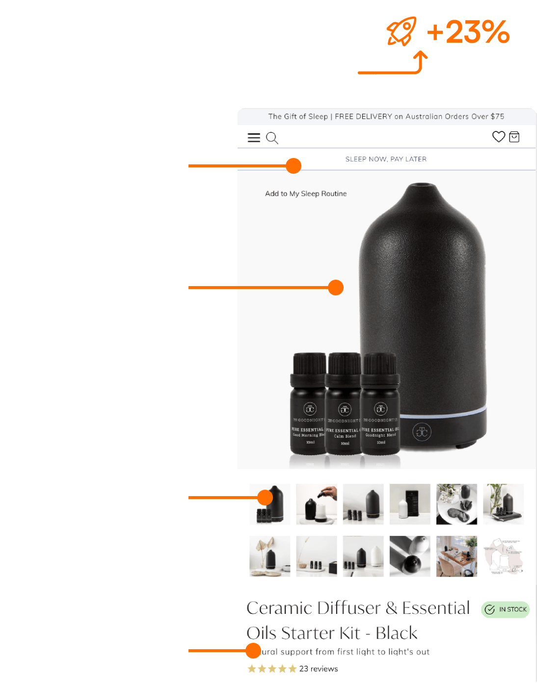
5. Make sure product images can be magnified, and give multiple views.
On the web, it’s (pretty much) all about visual appeal. Depending on the product, shoppers may want to have a closer look at the packaging, nutritional information, fabric details or different angles. After all, we all want to be sure we’ve got the right product.
True Protein allows its users to zoom in and get a better look at their minimalist packaging. True Protein knows its audience – the health-conscious – would want to know what’s in the product, and whether it is right for them. Simple, yet incredibly effective.
6. Use photos and videos to show the product used in context.
Help the shopper visualise how the product would realistically look and feel in their possession or in their space.
Bellroy does this in two ways. They showcase the practicality of their products by showing how many cards or notes can fit into one of their wallets. For the sling bag, the model provides a scale comparison so users can see the bag’s size and how stylish they might look if they bought it.
7. Countdown timers or available stock left = urgency.
We all know FOMO is real. If you give a shopper the feeling they might miss out on a great sale or a limited-stock item, they’re more likely to part with their cash #fact.
NordVPN does this by implementing a countdown timer. FYI, weeks after taking this screenshot, that timer is still going.
The Iconic instead displays “Low in stock” text – likely encourage a browsing shopper to buy immediately or face the dreaded “missed out” feeling.
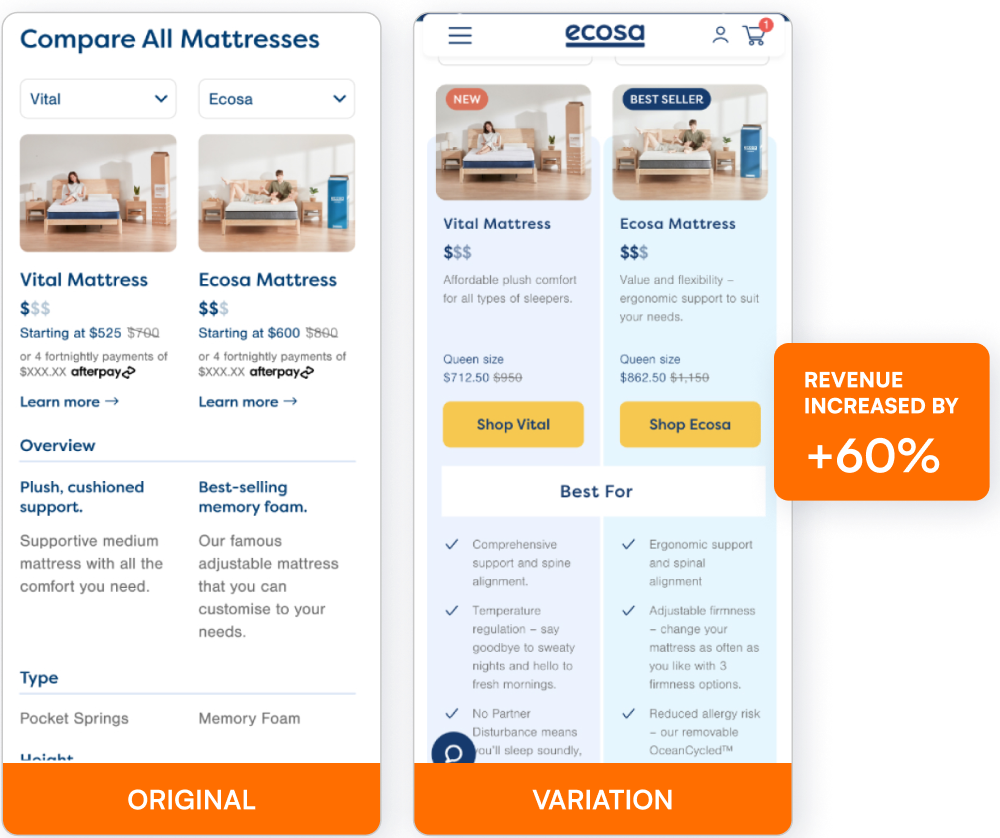
8. Maximise a shopper’s payment options.
Allow customers to walk away today with their desired goods or services without having to take out a loan, or pay upfront fees or interest. How? Offer a credit card alternative, such as AfterPay or Zip Pay to help shoppers split their payments into four future equal instalments.
For expensive products (such as new boots, or a new fridge because the old one just died) or services, the ability to ‘have now, pay later’ is a godsend.
Interest-free buy now, pay later would really help customers with purchasing a high priced item such as a mattress.
9. Show your estimated shipping times.
Do this and take away the guesswork, so people aren’t forced to divert elsewhere on the site or contact you to find out. Shoppers are impatient and more likely to purchase if this information is provided upfront.
Here, Mighty Ape has an “Availability” section that shows shoppers current stock levels, dispatch time, and estimated delivery all in one place on the product page.
Ritchie shows the estimated dispatch time and also the stock level remaining.
10. Show product reviews and ratings.
Most people trust reviews to help them make a purchase decision. Sharing your star ratings can quickly reveal what others think of the product. Providing more in-depth reviews in a section further down the page means shoppers who want extra information aren’t disappointed.
11. Show related and similar products and accessories.
Displaying related products, “others also purchased products” and accessories are great ways to upsell. True story: we have a special place in our hearts for online stores that make us feel like fashionistas when they reveal the accompanying jeans and shoes they’ve styled with the shirt we’ve been eyeing – all available for purchase.
12. Don’t lose your audience! Use breadcrumbs at the top left of the page to help shoppers find their way.
Help people navigate back to an earlier page if they need to, e.g. category or subcategory pages, so they can easily continue shopping. Rayban does this very well. They have lots of categories and subcategories that you can navigate through to find a product. You can easily click back where you came from.
How can I achieve this on my site?
Follow these tips mentioned above and implement them to your product page if you haven’t already:
- Plain background for product images
- CTA button colours should draw attention
- Allow saving products to a wishlist
- Give them an option for reminders when products come back in stock
- Allow product images to be zoomed. Show different angles, videos.
- Show the product being used in context.
- Create urgency with sales countdown timers or show stock availability.
- Allow Buy Now, Pay Later payment options.
- Provide shipping information/estimates.
- Show product reviews and ratings.
- Show similar, related products and accessories.
- User breadcrumbs on the top left side of the page.
But…
Best practices alone won’t solve all your drop off issues.
For sustainable long-term improvements, your data and real customer evidence can identify the changes and tests your site really needs. Our conversion experts will work with you to devise a unique plan – mining your data, observing customer behaviours, seeing which pages are hot (and which ones aren’t), and asking your shoppers what kind of site would keep them coming back.
We often see in-house digital marketing teams struggling to find the time for such thorough analysis, meaning critical insights are lost in an ocean of data. Our dedicated CRO team has devised an efficient, targeted process to uncover the hidden potential of your site and drive your revenue.
Take your conversions to the next level!
Best practices alone won’t solve all your drop off issues. For sustainable long-term improvements to your conversion rate, your data and real customer evidence can identify the changes and experiments your site really needs. We often see in-house digital marketing teams struggling to find the time for such thorough analysis, meaning critical insights are lost in an ocean of data. Our expert CRO team have an efficient, targeted Win at Experimentation™ process to uncover the hidden potential of your site and drive your revenue.
Uncover the hidden conversion opportunities in your ecommerce website with a Complimentary Website Conversion Audit. We will show you potential revenue leaks and insights you can take action on straight away. Together we’ll then help you develop an actionable optimisation and experimentation plan to improve your conversions and meet your ecommerce growth goals.
Take advantage of our complimentary Website Conversion Audit today >> HERE
Jeremy Shane is a Digital Optimisation Specialist at Conversionry, a leading Melbourne-based conversion optimisation agency, that accelerates conversion rates and revenue for global ecommerce and omnichannel retailers via data-driven optimisation and experimentation programs. He is a data-driven UX designer and has half a decade of experience running an ecommerce business. Jeremy is passionate about optimising ecommerce sites, delighting customers and create business success. On his off days, he loves going to the gym, boxing and taking his schnauzer for walks. 
Beat your competition to it!
Get the latest actionable conversion strategies delivered straight to your inbox!